Creating an e-commerce homepage that not only attracts visitors but also converts them into customers is an art and a science. In 2024, the average e-commerce website conversion rate hovers around just 2%, so every element on your homepage must be meticulously crafted to maximize engagement and drive sales. Here’s a detailed guide on how to build a high-converting e-commerce homepage.
In the competitive world of e-commerce, a high-converting homepage is crucial. Learn how to design a homepage that attracts visitors and turns them into loyal customers.
This guide covers essential elements and best practices to help you create an engaging and effective e-commerce homepage.
Key Elements of a High-Converting E-Commerce Homepage
1. Hero Block
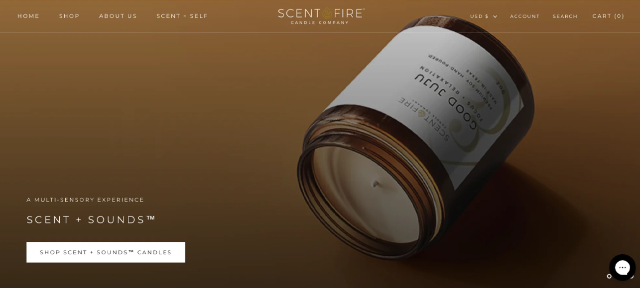
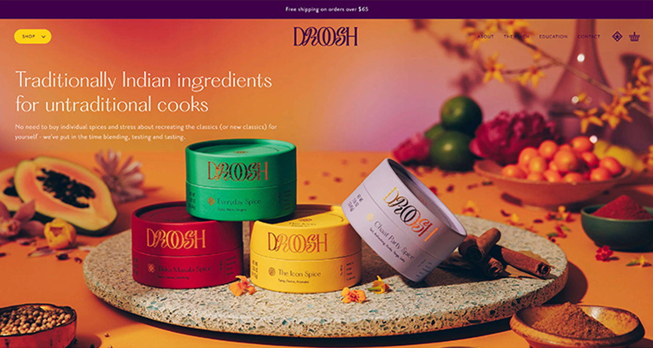
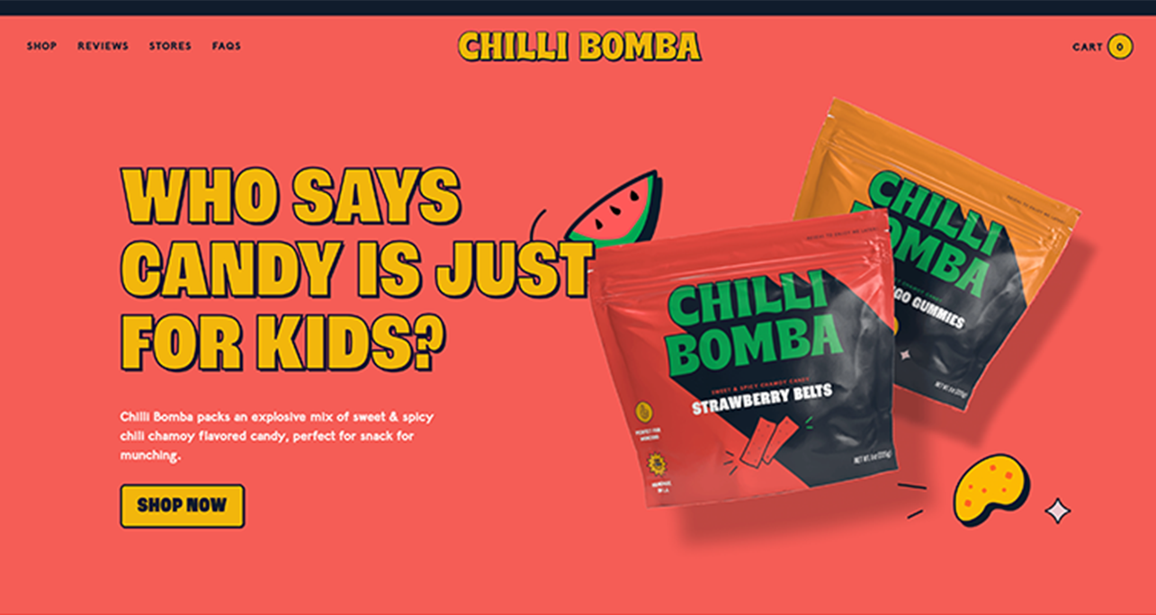
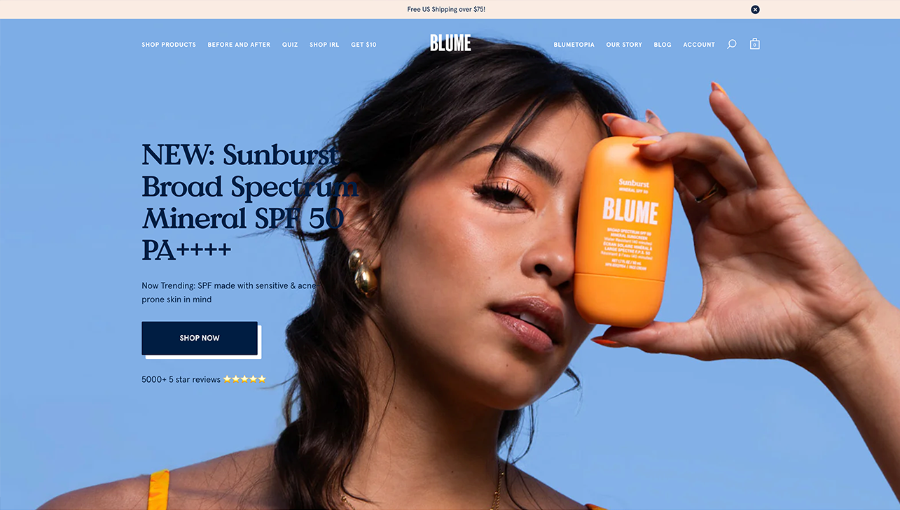
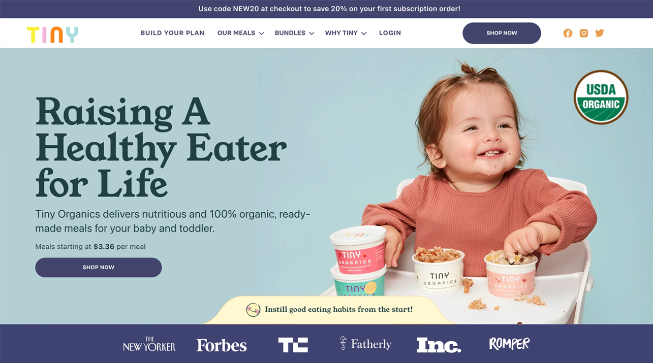
Start with a strong hero block that grabs attention instantly. Include a clear heading with your value proposition, a brief product description explaining how it delivers on its promise, and a high-quality visual showcasing your product in action. Add a compelling call-to-action button and a snippet of social proof to build immediate trust.
Heading 1 with Value Proposition: Start with a strong, clear value proposition that immediately communicates what makes your store unique. This is your chance to hook your visitors within the first few seconds.
Product Description: Briefly explain how your product delivers the promised value. Keep it concise and focused on benefits.
Product Visual: Use a high-quality visual, like a loom-style demo, gif, or screenshot, to showcase your product in action. This helps potential customers quickly understand what you're offering.
Call-to-Action (CTA) Button: Include a single, compelling CTA. Avoid using words like "buy" or "purchase"; instead, use phrases like "Get Started" or "Discover More."
Quick Social Proof: Add a snippet of social proof, such as the number of customers, average rating, or a one-sentence testimonial to build trust right away.
2. Problem Agitation
Highlight the current solution your product aims to improve. Describe three negative consequences of sticking with this status-quo solution to emphasize the need for your product.
3. Transformation
Show how your product provides a better solution. Include an alternative product visual to illustrate its benefits and highlight three positive outcomes of switching to your product.
4. Social Proof
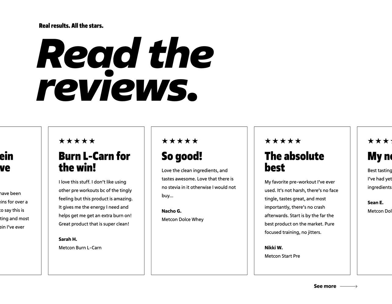
Build credibility with 3-7 customer testimonials featuring their faces, roles, and key points from their feedback. Include endorsements from opinion leaders if possible.
Customer Testimonials: Include 3-7 testimonials from satisfied customers, featuring their faces, roles, and key points from their feedback.
Endorsements: If possible, add endorsements from 1-3 opinion leaders or influencers in your industry.
5. Features
Organize your product features into 3-4 groups for easy recall. Each group should focus on a different aspect of the product’s functionality. Use visuals, preferably gifs, to illustrate each feature.
This section is more than just a summary of your company; it's an opportunity to connect with your audience on a personal level.
6. About Us
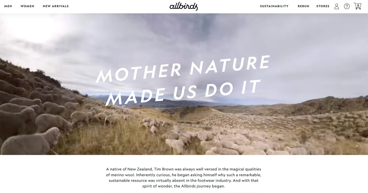
Share your brand's story and mission in a compelling way. This section is more than just a summary of your company; it's an opportunity to connect with your audience on a personal level. Start by explaining why your brand was created and the core values that drive your business. Use engaging storytelling techniques to draw readers in, such as describing a pivotal moment that inspired the company's inception or a challenge your team overcame to achieve success. Highlight your mission and vision, showing how they guide your actions and decisions.
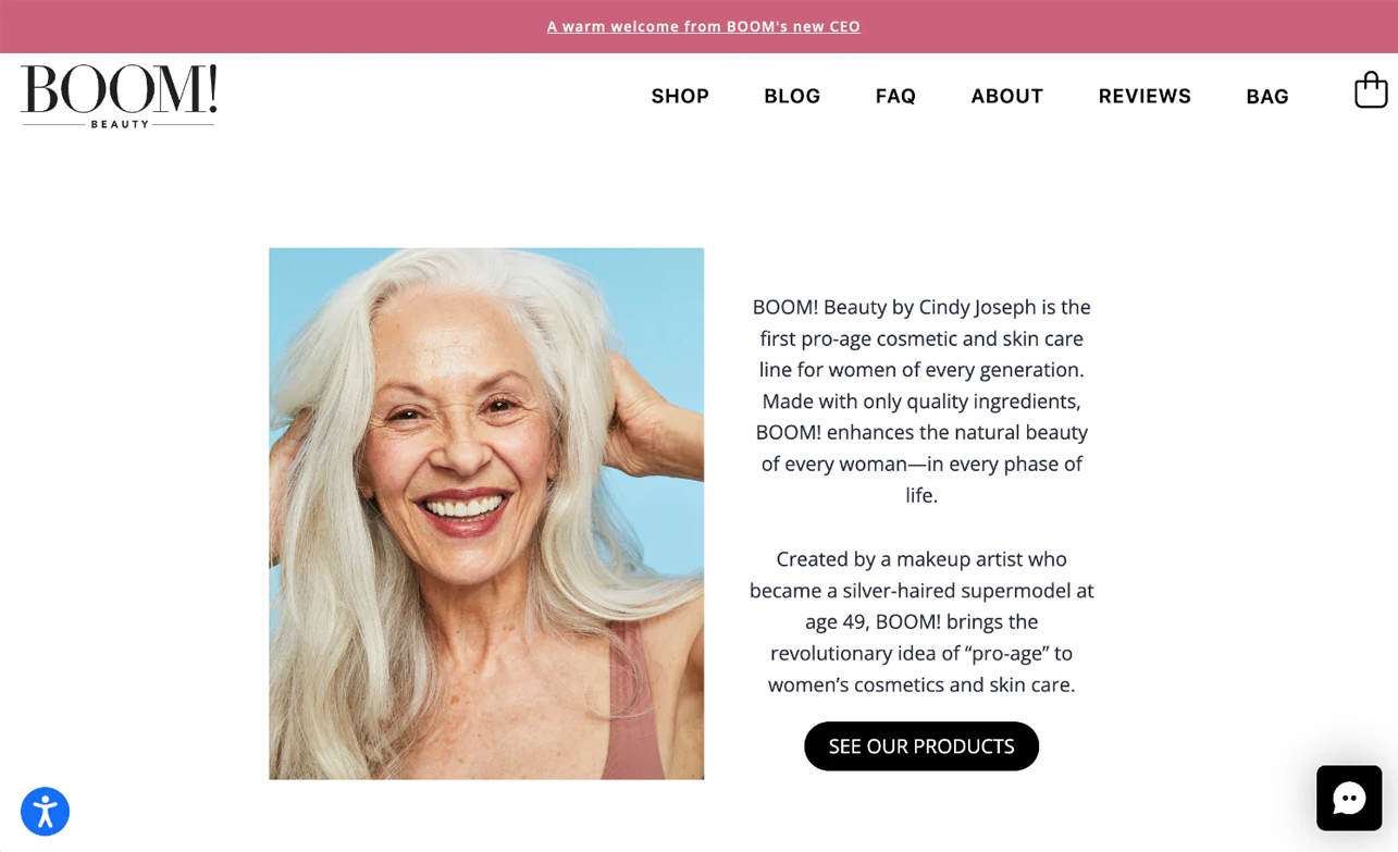
Additionally, include personal elements that humanize your brand. Introduce the founders and key team members with brief bios and photos to create a relatable and trustworthy image. You might also share behind-the-scenes glimpses of your company culture or community involvement to further build affinity with your audience.

7. Pricing
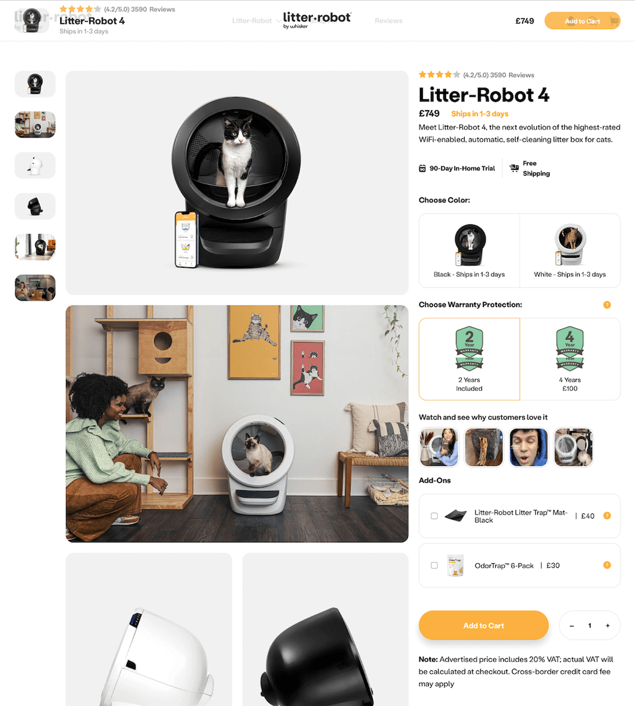
Offer a few straightforward pricing options, such as single-item prices, bundle deals, or bulk purchase discounts. Use pricing that ends in $9 or $7 to appeal to customers. Clearly outline what each option includes and highlight your money-back guarantee to reduce purchase anxiety.
Pricing Plans: Offer 2-3 pricing plans, ensuring there’s always an upsell option. End prices in $9 or $7 to appear more appealing.
Conditions: Clarify if the pricing is for a subscription or a one-time payment, and outline 3-5 conditions for each plan.
Money-Back Guarantee: State your money-back guarantee to reduce purchase anxiety.
8. FAQ
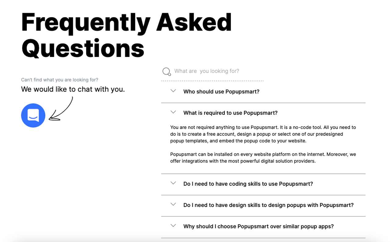
Address 5-7 common objections your audience might have. Provide straightforward, concise answers to reassure potential customers.
Practical Tips for a High-Converting E-Commerce Homepage
Consistency
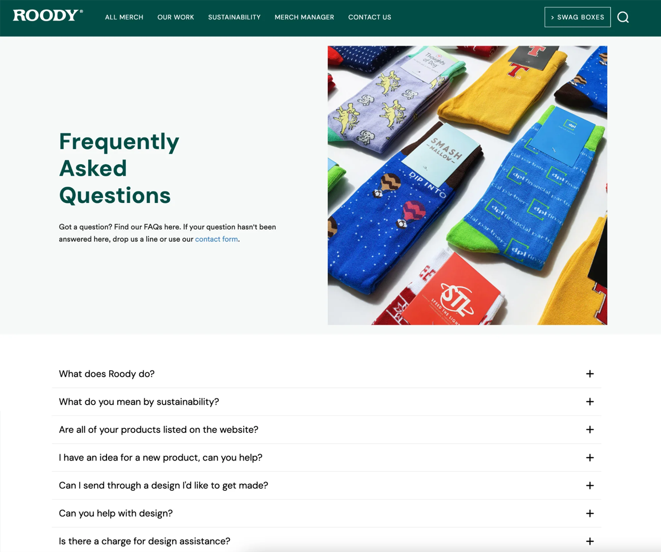
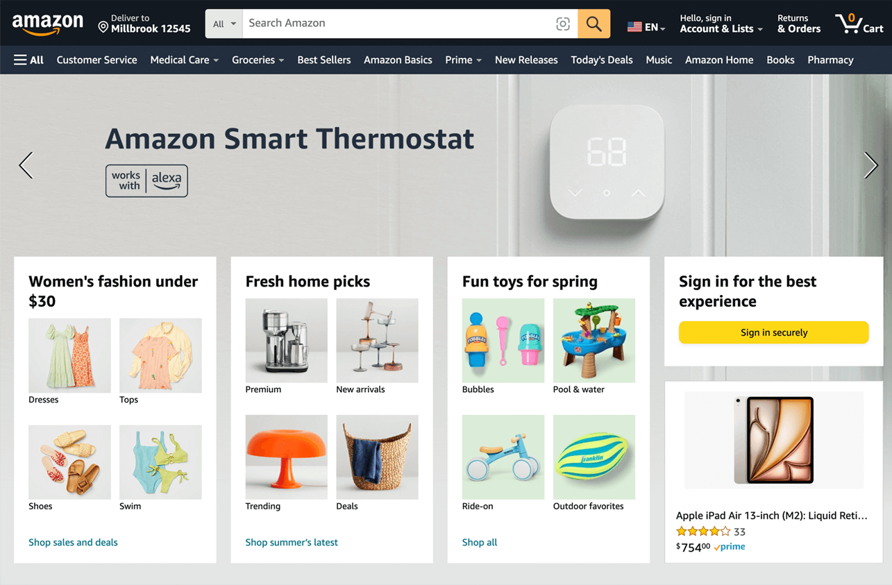
Ensure a familiar layout with key elements like the logo, search bar, cart, and account information in recognizable places. This helps visitors quickly find what they need. Arrange elements by importance using larger fonts and bolder colors for key sections like product categories and promotions. Ensure your branding is consistent with your ad traffic by using similar colors, fonts, and imagery to reinforce brand identity.
Ensure your homepage design is responsive and looks cohesive on all devices and browsers.
Branding
Make your unique value proposition clear in the first fold. Use headlines and subheadings to convey what your visitor wants to hear. Craft a value proposition with the customer in mind, highlighting free shipping, eco-friendly products, or exceptional customer service. Ensure your homepage design is responsive and looks cohesive on all devices. Tailor your branding elements to resonate with specific audiences in different regions.
Narrative
Capture visitors' attention with a bold statement, intriguing question, or captivating visual. Weave your brand’s story with product benefits to generate curiosity and ease potential customers into taking the next steps. Use images, videos, graphics, and animations to enhance your narrative and create a memorable impression.
Navigation
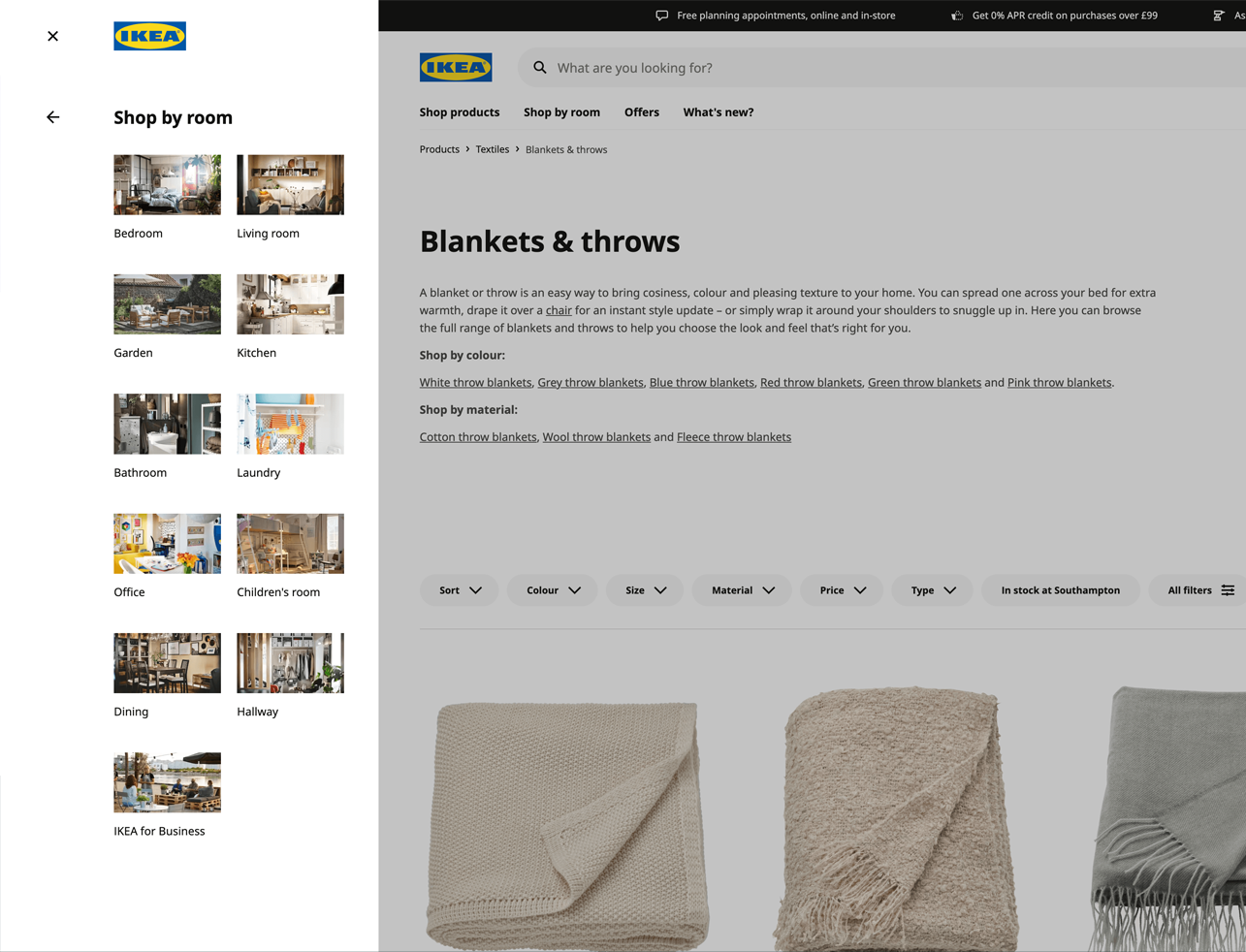
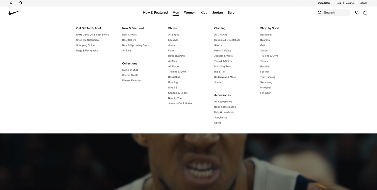
Simplify navigation by removing unnecessary clutter and dividing the homepage into scrollable sections. Ensure accessibility features like screen reader compatibility, keyboard navigation, and alternative text for images are in place to make your site inclusive.
Trust
Highlight social proof with numbers and customer reviews. Showcase your social media presence and use videos to build credibility.
Reciprocity
Offer mystery discounts for repeat customers to incentivize purchases. Include a mystery freebie or sample with each purchase to delight customers. Create a rewards program to encourage eco-friendly practices and foster shared values with your customers.
Implement virtual shopping assistants to offer personalized product recommendations and support.
Connection
Provide clear contact options above the fold to ensure visitors can easily find support. Implement virtual shopping assistants to offer personalized product recommendations and support. Use AR technology to help customers visualize products in real time, aiding informed purchasing decisions and reducing returns.
Conclusion
Building a high-converting e-commerce homepage requires a strategic blend of compelling design, clear communication, and engaging storytelling. By focusing on key elements like a strong hero block, effective social proof, and intuitive navigation, you can create a homepage that not only attracts visitors but also converts them into loyal customers. Continuously test and iterate to improve your homepage’s performance and drive more sales. For more inspiration, visit Costura's e-commerce examples.


