
At Costura.io, branding and design are at the core of what we do, and we always keep an eye on brands that go through radical visual changes. When Printify unveiled its new "Make it Your Way" branding, we felt compelled to talk about it. As product and brand design experts, we noticed both the bold moves Printify made and the subtleties in their design choices.
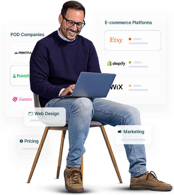
Founded in 2015, Printify has revolutionized the print-on-demand (POD) industry by providing a platform that allows creators, entrepreneurs, and businesses to design and sell custom products without upfront inventory costs. Printify connects users to a network of printing partners across the globe, streamlining the process of creating and shipping custom products like t-shirts, mugs, and home decor. This model has empowered millions of creators around the world to monetize their designs, significantly lowering the barriers to entry in e-commerce for creative professionals and small businesses.
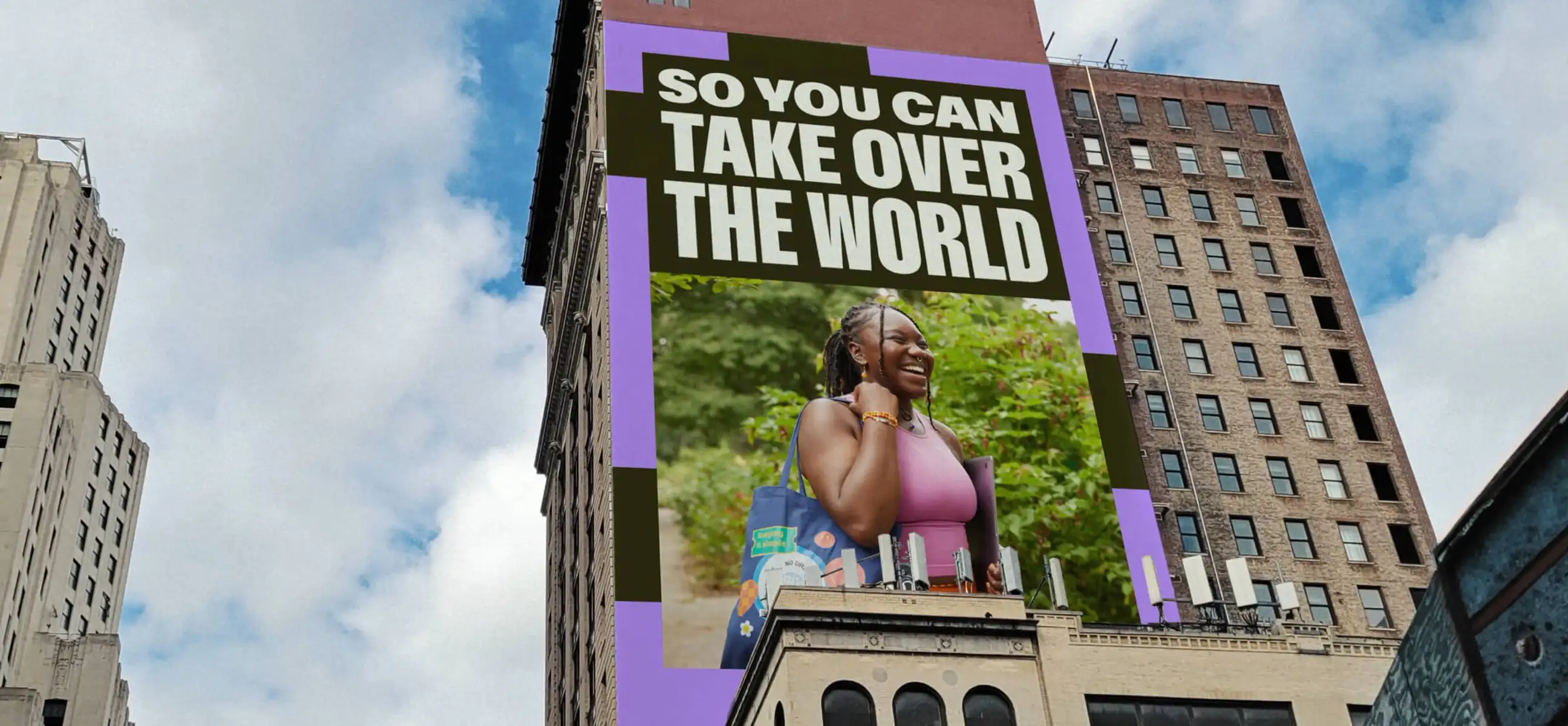
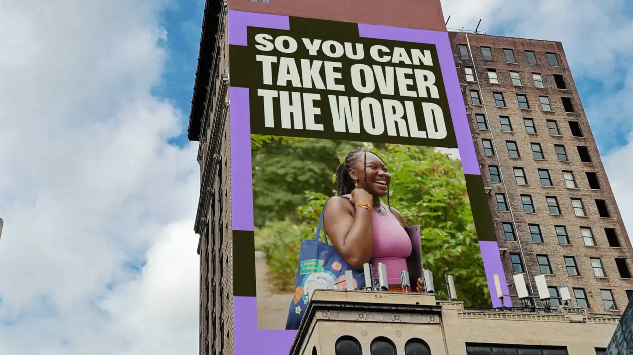
The rebranding is designed to inspire sellers to express their individuality and break away from traditional work structures
After many years with the same branding and "look & feel", the Latvian print on demand company has launched a new branding campaign called "Make it Your Way," emphasizing user empowerment and creative freedom for entrepreneurs. The fresh look includes a stronger focus on green as a symbol of profit and incorporates clean typography to amplify user voices. The rebranding is designed to inspire sellers to express their individuality and break away from traditional work structures. Let's break it down into a series of categories:
Simplified Logos and a Modern Trend
Like many brands today, Printify decided to leave behind the icon or symbol that previously accompanied their brand name. Instead, they now showcase their brand word in isolation.
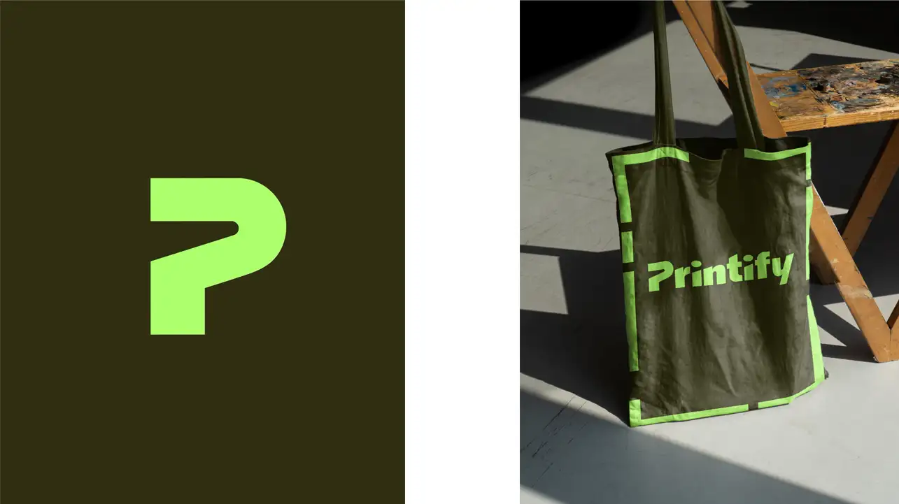
This is a modern approach, and we’ve seen it work well for many companies, as it allows the brand name itself to become the focal point of recognition. However, it also means the design needs to be striking and memorable to fill the space left by the absence of an icon. For Printify, the new typography does a decent job, but some might argue that it lacks that iconic punch.
Bright, Yet Mature Color Choices
A noticeable aspect of Printify’s new look is the use of bright but warm colors. The dark green background paired with bright, almost fluorescent green accents is a bold move.
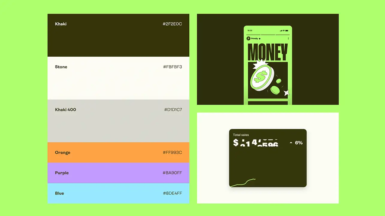
This combination of dark and vibrant tones is popular in the world of branding today, but what we really like is their choice of a deeper green. While many brands go for brighter, almost neon greens, Printify’s darker tone gives the brand a sense of maturity and elegance, setting it apart from competitors who opt for more playful hues.
Typography and Visual Language
The typography is clean and functional, which is in line with the overall push towards simplicity and user-centricity.
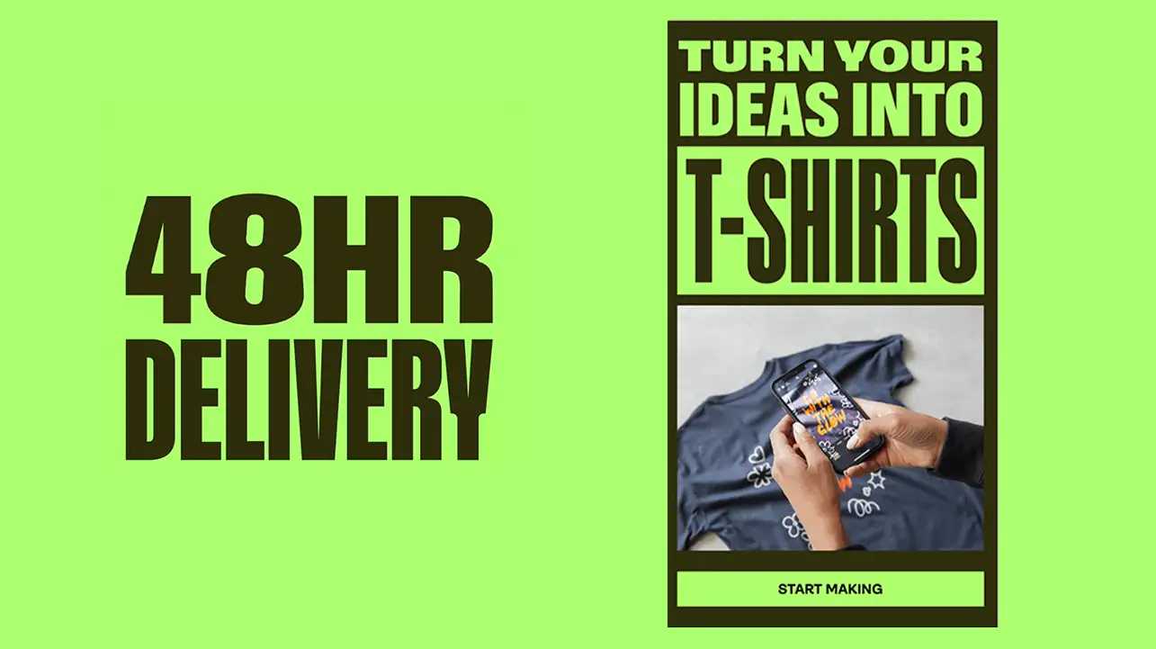

It speaks to the entrepreneurial audience that Printify aims to empower, but we feel there could have been a more distinct flair to the fonts chosen. The design is user-friendly and effective, but we would have liked to see something that offers a more unique personality to the brand, especially in a crowded marketplace.
Overall Impression
Printify’s new branding strikes a balance between being modern and sophisticated. The color choices, simplicity of the logo, and removal of icons signal a mature approach, while also embracing the creativity of its users. However, the move towards a minimalist logo design—leaving the brand name without an accompanying symbol—comes with the risk of being too subtle in a visually saturated market.
We appreciate Printify’s approach and look forward to seeing how it resonates with their audience.
As a brand that’s growing its presence, Printify has made smart design decisions to convey empowerment and growth, but we’ll be keeping an eye on how they continue to evolve visually.
At Costura.io, where design and branding are at the heart of what we do, we appreciate Printify’s approach and look forward to seeing how it resonates with their audience.
Check out the new look for yourself and let us know what you think: Printify - Make it Your Way.